Cradle2base interface system
A compact reference for the corporate identity, active component set, visual tokens, and common product compositions used across the EPD workflow.
Brand Identity
Corporate identity references translated from Base presentation round 01.
Primary and secondary colours
Source: printed slide 04, physical PDF page 5. Hex values are sampled from the uniform colour blocks in the PDF.
Lime
#d7ff93--brand-lime
Primary brand accent
Off-white
#f3f2ec--brand-off-white
Default canvas
Off-black
#272733--brand-off-black
Primary text and dark surfaces
Grey
#6c6c76--brand-grey
Secondary copy and structure
Mocca
#a7a29e--brand-mocca
Warm neutral support
Cream
#dfdbd0--brand-cream
Subtle surfaces
Gradient language
Source: printed slide 05, physical PDF page 6. Gradients are documented as brand surfaces, not default form-control styling.
Soft lime / mineral
--brand-gradient-1
Light editorial backgrounds
Deep technical
--brand-gradient-2
Dark hero or report covers
Lime / concrete
--brand-gradient-3
Transitional panels
Muted material
--brand-gradient-4
Quiet secondary surfaces
Typography
Source: printed slide 06, physical PDF page 7. PP Neue Montreal is the primary brand font; Space Grotesk is the secondary supporting font.
var(--font-brand-primary)
Aa
PP Neue Montreal
Loaded locally with next/font/local from app font assets.
abcdefghijklmnopqrstuvwxyz 0123456789 #&?@:.
var(--font-brand-secondary)
Aa
Space Grotesk
Loaded locally with next/font/local from app font assets.
abcdefghijklmnopqrstuvwxyz 0123456789 #&?@:.
Logo concepts
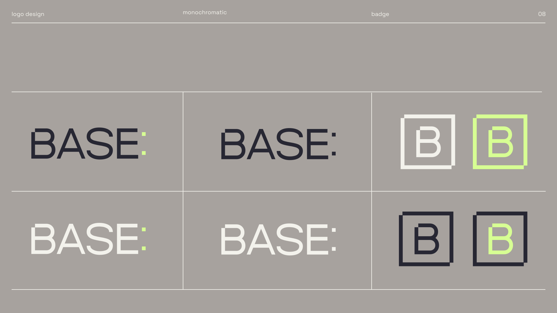
Source: printed slide 08, physical PDF page 9. The reusable SVG variants are exported from @c2b/web-brand-ui and kept as transparent assets in packages/web/brand/ui/src/assets.

Dark lime wordmark
base-wordmark-dark-lime.svg
Dark monochrome wordmark
base-wordmark-dark-monochrome.svg
Light lime wordmark
base-wordmark-light-lime.svg
Light monochrome wordmark
base-wordmark-light-monochrome.svg
Light badge
base-badge-light.svg
Lime badge
base-badge-lime.svg
Dark badge
base-badge-dark.svg
Dark lime badge
base-badge-dark-lime.svgSource slide comparison
Tokens
Semantic colors exposed by the shared UI package.
Background
var(--background)Base app canvas
Foreground
var(--foreground)Primary text
Primary
var(--primary)Main action
Secondary
var(--secondary)Quiet surface
Muted
var(--muted)Subtle panel
Accent
var(--accent)Hover/selected state
Destructive
var(--destructive)Danger state
Border
var(--border)Dividers
Buttons
Primary actions, secondary commands, destructive paths, and icon-only controls.
Controls
Form controls used for filters, review choices, and extraction settings.
Blocks publishing until a reviewer confirms source evidence.
Keeps low-confidence fields visible in review screens.
Toolbars
Dense command rows for repeated review workflows.
Cards
Card composition for contained summaries and entity overviews.
86%
Fields matched to expected EPD schema.
14
Findings need reviewer decisions.
100%
Mutations produce audit events.
Tables
Compact tabular display for extraction rows and review states.
| Indicator | Source | Status | Value |
|---|---|---|---|
| A1 foundation slab | EPD-1844.pdf | Validated | 42.8 kg CO2e |
| B6 operational energy | Manual correction | Review | 18.2 kg CO2e |
| C3 waste processing | Gemini extraction | Flagged | 3.7 kg CO2e |
Tabs
View switching for extraction, correction, and audit panels.
Overlays
Modal and side-panel patterns for review tasks.
Confirmations
Destructive actions use AlertDialog with a clear title, consequence, and safe cancel path.
Scroll areas
Bounded lists keep audit trails, sources, and parser logs inside their panel.
Loading and empty states
Use Skeleton while data is loading and Empty when a workflow has no content yet.
Batch processing can continue in the background.
Feedback
Status banners, badges, and toast notifications.